Legacy Design Product Page Redesign: Before and After
A Shopify product page for Legacy Design, a store that sells handcrafted Afrocentric brass and cowrie jewelry. We redesigned the layout and sections of the product page, shown here on the Abena Cowrie Bloom Earrings, for a client. This page compares it before and after, and explains the conversion-focused design decisions behind it.
Our scope: the layout and sections of the product page template. The store, photography, products, prices and reviews are the client’s.
Built for a client. We claim no sales, traffic, conversion or revenue results for this page.
Visit Legacy Design at bylegacydesign.com (opens in a new tab)
Want this kind of work for your store?
What we delivered: the product page layout and sections: reassurance rows by the buy buttons, a star line, secure checkout icons, a collapsible Product details row, a three-column FAQ band, a community reviews section and a Gift Guide link in the header.
Custom page work like this is quoted separately after a brief. It is not part of the $80 Basic Store Setup.
Send a short brief, get a written recommendation and price within 24 hours, then agree the scope before any work starts.
The product page on desktop
The same product page for the Abena Cowrie Bloom Earrings, before and after the redesign. Each frame scrolls: use your mouse or finger, or focus a frame and use the arrow keys.
Before Desktop
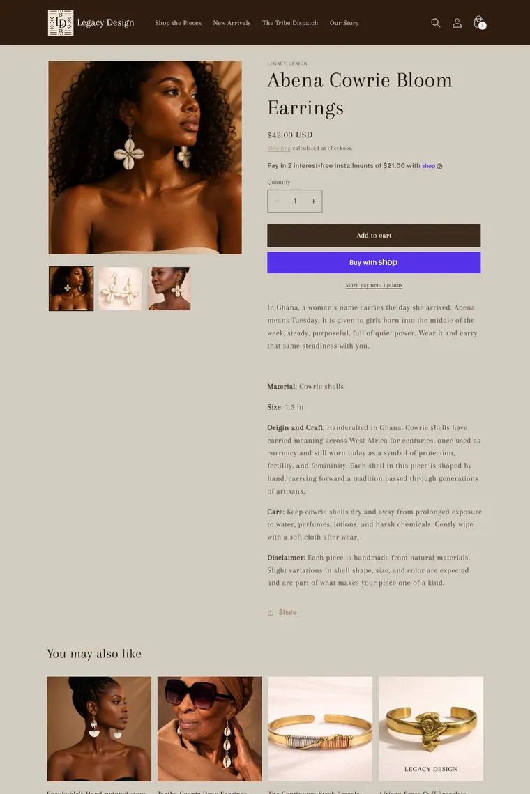
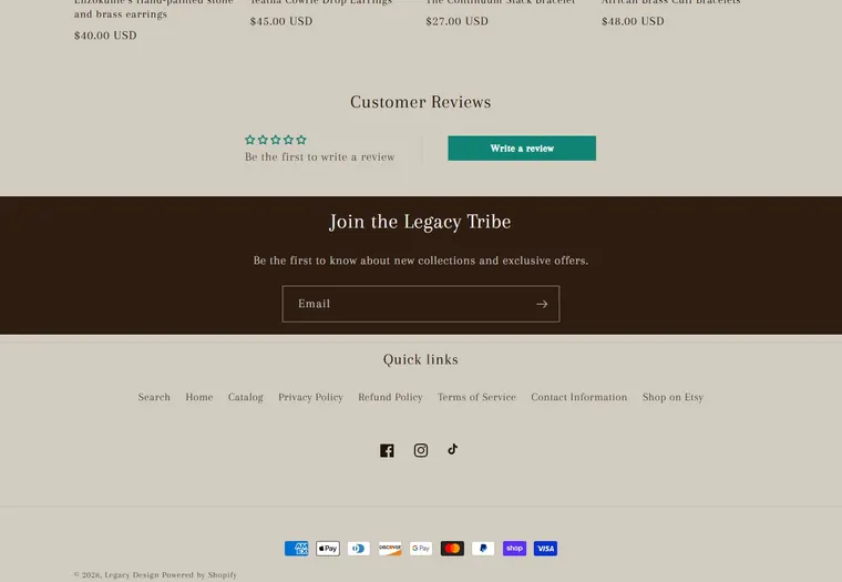
After Desktop
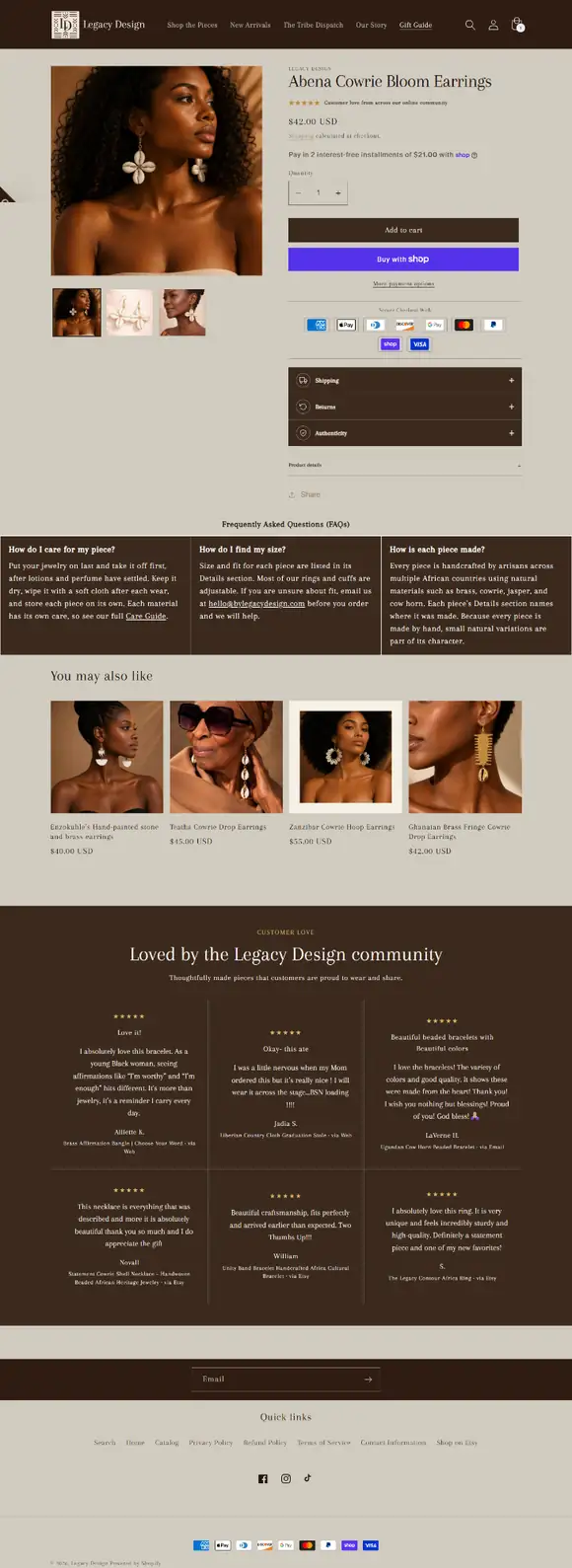
The two screenshots were captured at different sizes, so text can look larger in one frame than in the other. The product, photos, prices and reviews in both are the client’s.
The product page on a phone
The before screenshot scrolls inside the phone frame. The after recording does not autoplay.
Before Phone


After Phone
What changed between before and after?
The visible changes, one by one. This is the full list.
Reassurance rows by the buy buttons
Three collapsible rows, each with an icon, sit directly under the buy buttons: Shipping, Returns and Authenticity.
A star line under the title
A five-star line sits under the product title with the words “Customer love from across our online community”.
Secure checkout icons
A row of payment icons, headed “Secure Checkout With”, sits under the buy buttons.
The description folded into Product details
The long block of plain description text now sits in a collapsible Product details row, so the page no longer runs straight from the buy buttons into a wall of text.
A three-column FAQ band
A Frequently Asked Questions band is split into three columns: how to care for a piece, how to find your size and how each piece is made.
A community reviews section
The nearly empty Customer Reviews block became a dark section, “Loved by the Legacy Design community”, with six review cards. Each card shows the reviewer’s name or initial, the product reviewed and where the review came from. The reviews are the client’s own.
A Gift Guide link in the header
The header menu gained a Gift Guide link beside the four existing links: Shop the Pieces, New Arrivals, The Tribe Dispatch and Our Story.
Why is the page laid out this way?
Conversion-focused design decisions, and the reasoning behind each one. These are decisions, not results.
Answers where the decision happens
A shopper about to press Add to cart may stop to check shipping, returns or whether a piece is genuine. Collapsible rows keep those answers next to the buttons without making the page longer.
Scannable instead of a wall of text
One long run of description text is hard to scan, most of all on a phone. Folding it into one row and putting the common questions into three short columns lets a visitor read only what they need.
Payment reassurance at the button
The payment icons and the words “Secure Checkout With” sit right under the buy buttons, at the moment a shopper decides whether to pay.
Show the reviews the store already has
An almost empty reviews block gives a visitor nothing to read. Showing the client’s own reviews, each with the product it is about, puts customers’ words on the page. We make no claim about what that does for the store.
A route to gifting
The Gift Guide link in the header gives a shopper who is buying a gift a way into that part of the store from the product page.
It still looks like the store
The new rows, the FAQ band and the reviews section use the same dark brown as the header and the newsletter band, so they read as part of the client’s store and not as add-ons.
What did we build, and what is the client's?
Our scope: the layout and sections of the product page template. The store, photography, products, prices and reviews are the client’s.
Our scope
The layout and sections of the product page template, as listed under “What changed” above.
The client’s own work
- The store, its header and footer, and the Legacy Design name, logo and brand.
- The photography and the product itself, the Abena Cowrie Bloom Earrings, with its description, price and the related products.
- The reviews in the community section, and the customers who wrote them.
- The store policies and product facts that the Shipping, Returns, Authenticity and FAQ rows refer to.
What does this case study not claim?
- Sales, traffic, conversion or revenue. We claim none, and we show no before and after numbers.
- That the changes made any difference to how the store performs. We have no results to show, so we do not say so.
- A client quote or review of our work. There is none on this page.
- Ownership of the store, the photos, the products, the prices or the reviews. They are the client’s. We built the layout and sections of the product page.
Also built for Legacy Design
We also built the Legacy Gift Guide for the same client: a banner, five shortcut boxes and a featured collection, shown on a phone.
Read the Legacy Design Gift Guide case studyWant your Shopify product page redesigned?
Send a short brief. We reply within 24 hours, in writing, with what we would change and what it costs before any work starts.